Overview
Role
Canyon Clothing Co. is a sustainable outdoor apparel brand built for modern explorers and young families who value durability, comfort, and style. Inspired by the colors and textures of desert landscapes, this brand identity strikes a balance between rugged utility and approachable charm. The goal was to create a design system that felt adventurous, family-friendly, and environmentally conscious.
Directed the full brand identity including logo system, visual language, packaging, and apparel application. Developed strategy and tone to align with the values of sustainability, playfulness, and long-term durability. Created a scalable design system to support future expansion into physical and digital retail environments.
Design Solution
Outcome
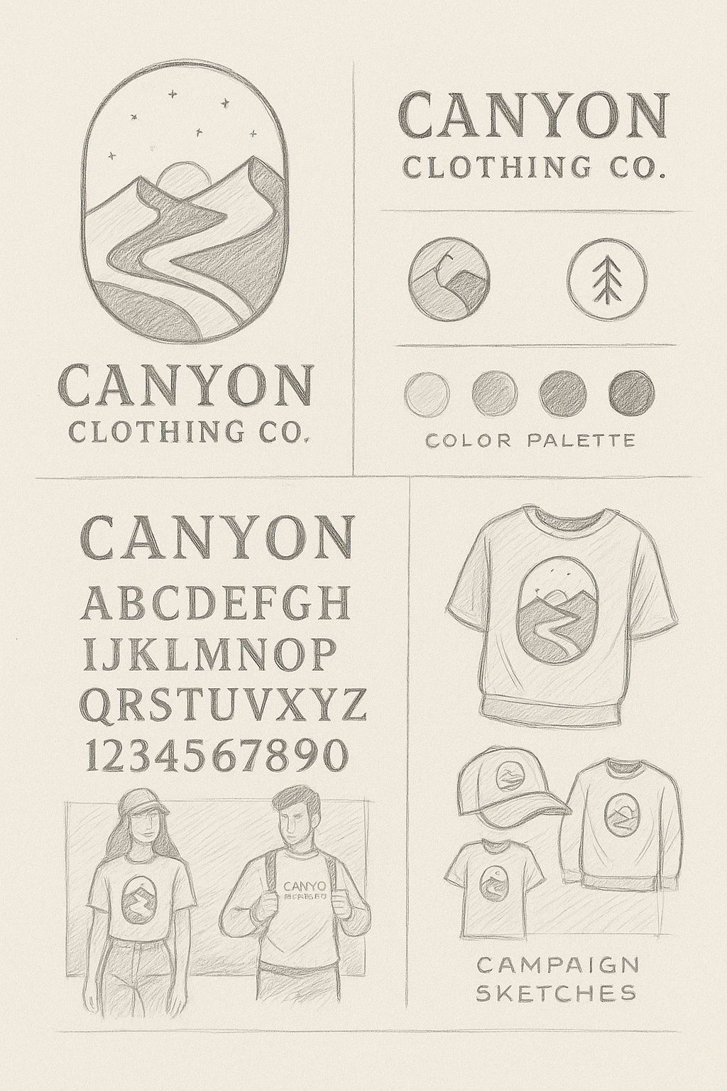
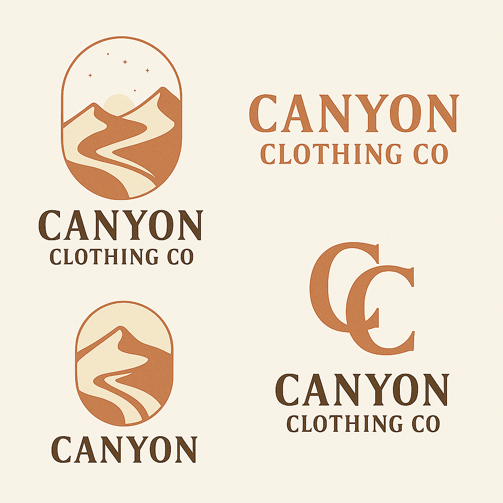
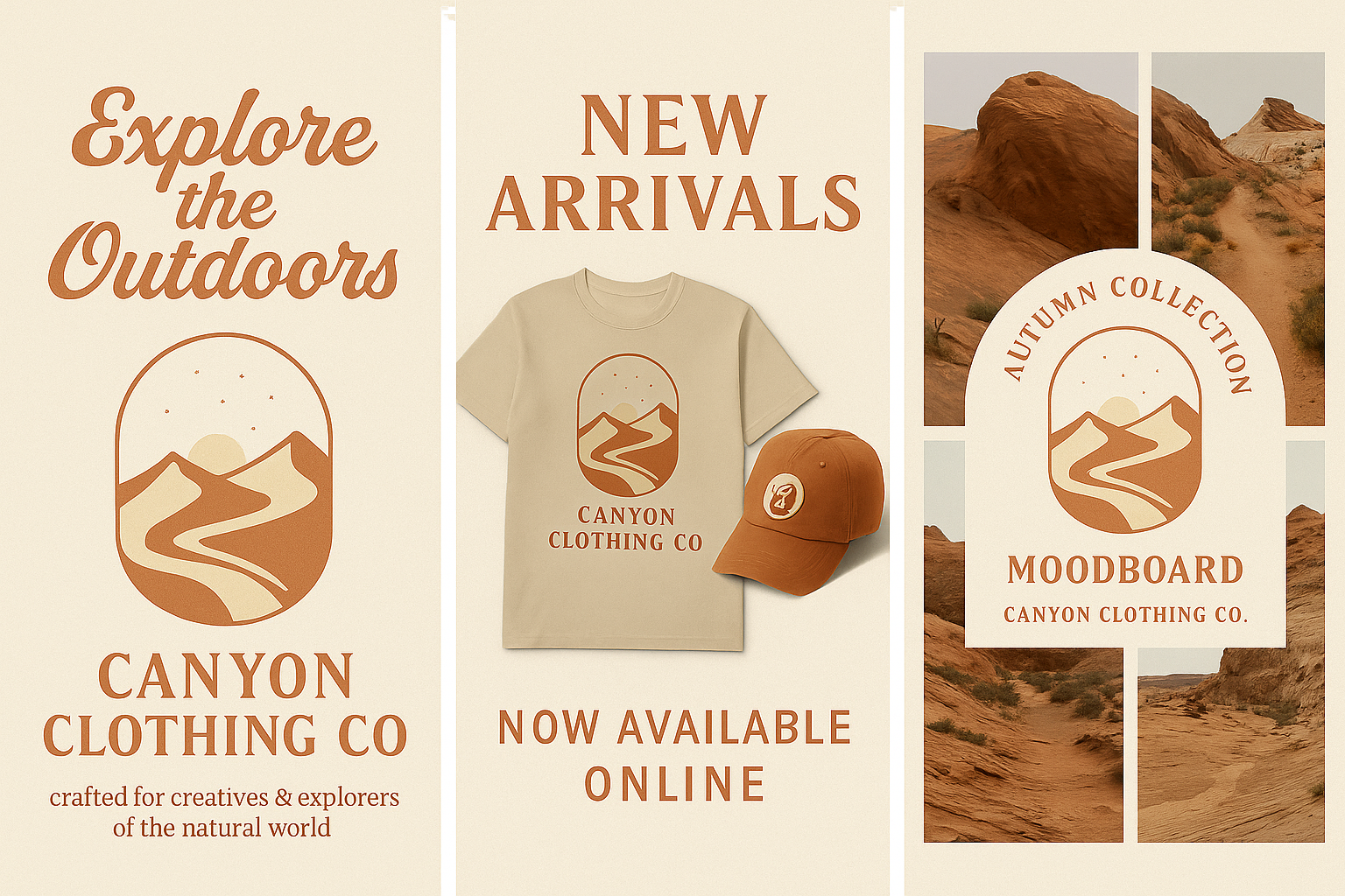
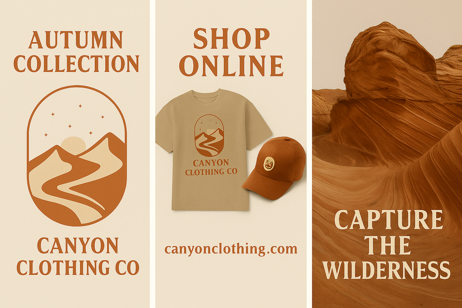
The logo system is inspired by topographic lines and trail markers, merging outdoor symbolism with friendly, modern geometry. Earthy tones and bold typography communicate strength and reliability, while rounded details soften the brand for family-friendly appeal. Patterns and textures were designed to mimic natural materials, helping reinforce the sustainable and durable nature of the product.
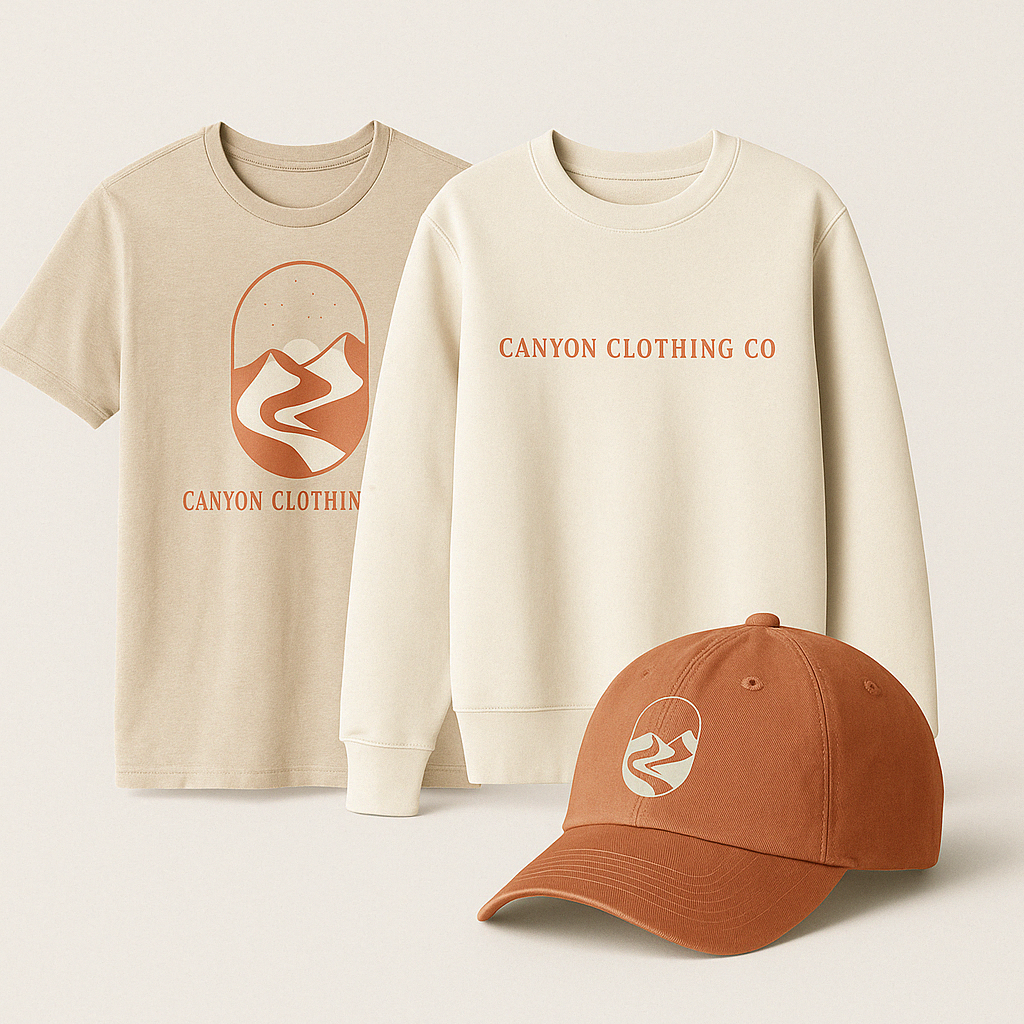
Applications include woven tags, garment labels, packaging, and promotional apparel for kids and adults. Each brand element was designed with flexibility in mind—able to scale across hang tags, signage, and e-commerce.
The result is a cohesive brand identity system that evokes trust, playfulness, and eco-conscious adventure. Canyon Clothing Co. now stands as a lifestyle brand that’s ready for real-world launch—positioned to connect with both young parents and outdoor enthusiasts alike. The visual system is adaptable, emotionally resonant, and built to grow.
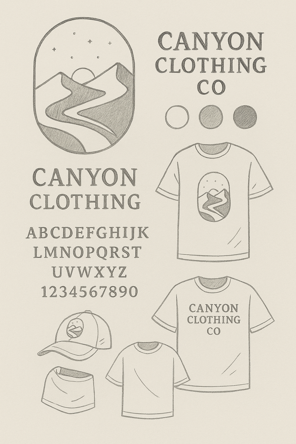
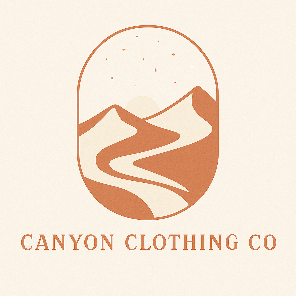
Logo & Brand Identity
Designed a soft, minimal identity system centered around a winding path logo—symbolizing exploration, journey, and natural flow. Built for seamless use across print, tags, digital, and in-store displays.
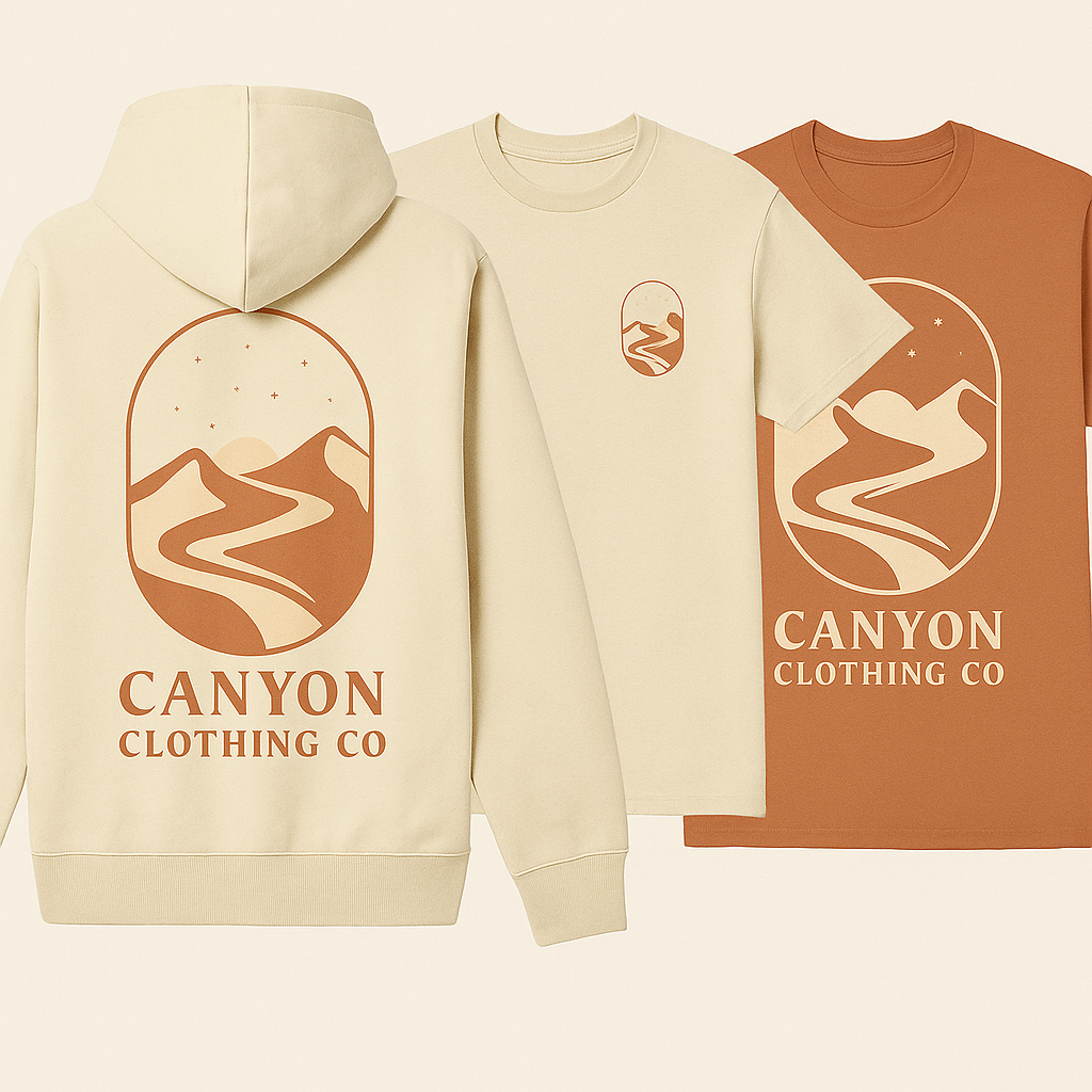
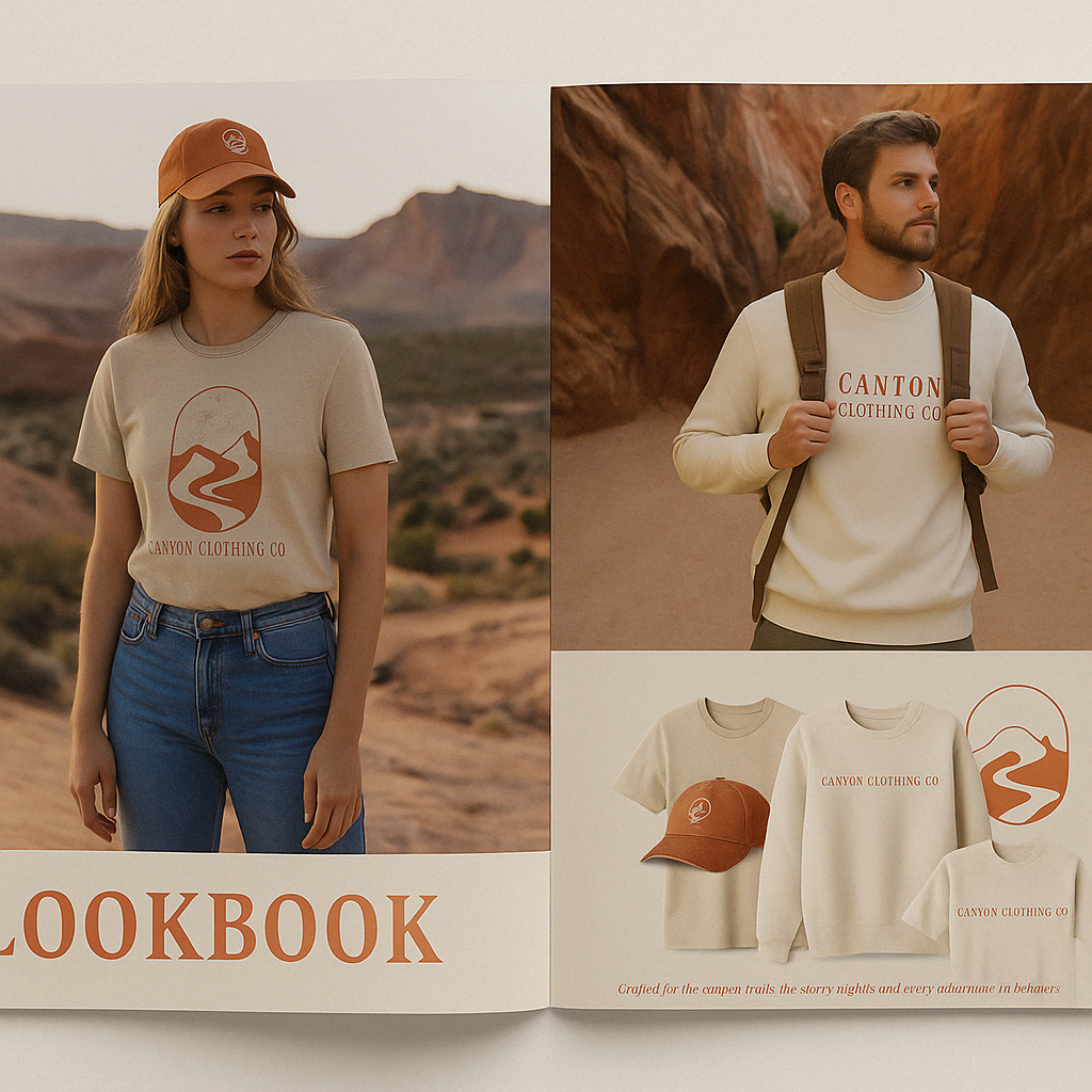
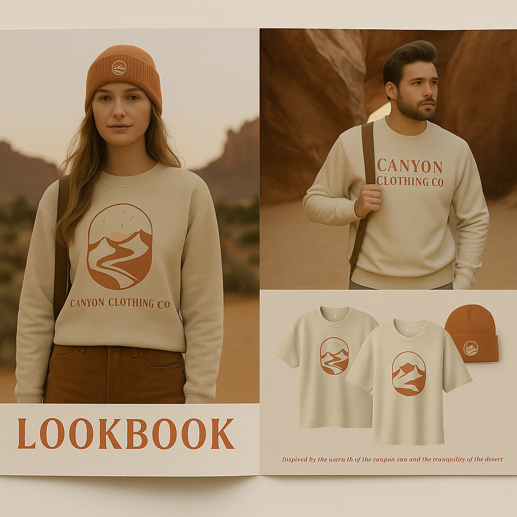
Brand Identity & Apparel Design
Created a collection of screen-printed apparel featuring natural elements and trail-inspired iconography. Each seasonal drop reflects changing landscapes, from sun-faded summers to crisp autumn tones.
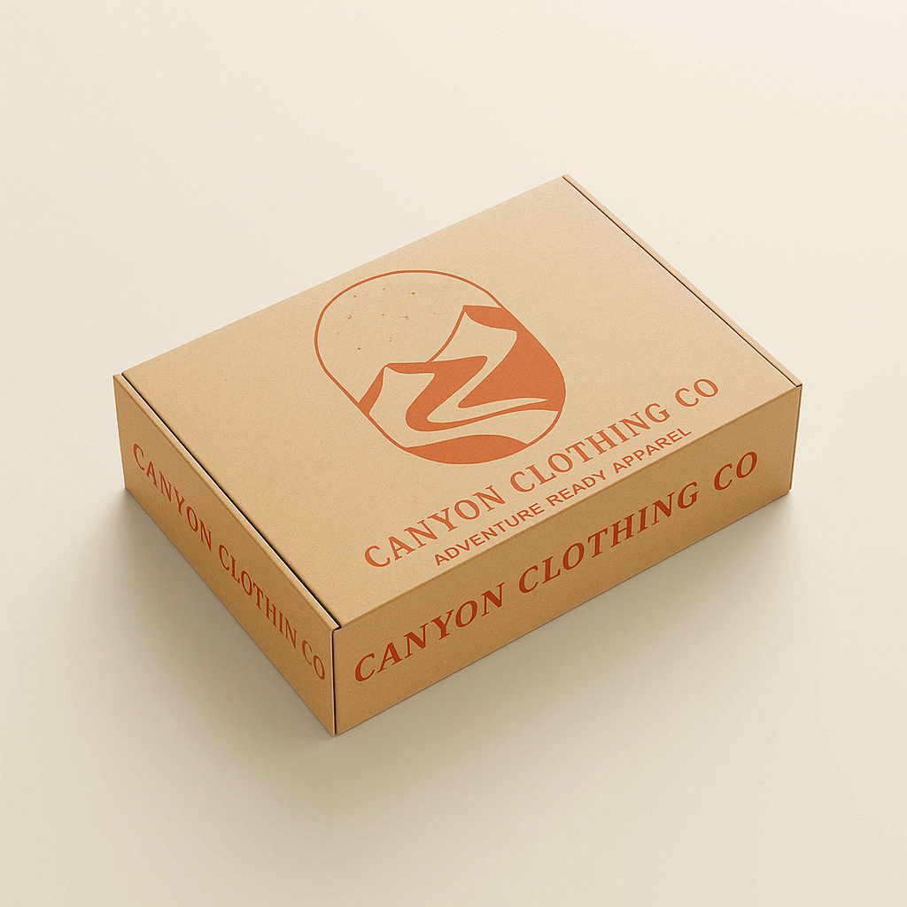
Print Materials & Packaging
Developed minimal hangtags, postcards, and folded labels using textured papers and soft-touch finishes—designed to reinforce Canyon’s tactile, earth-connected brand experience.
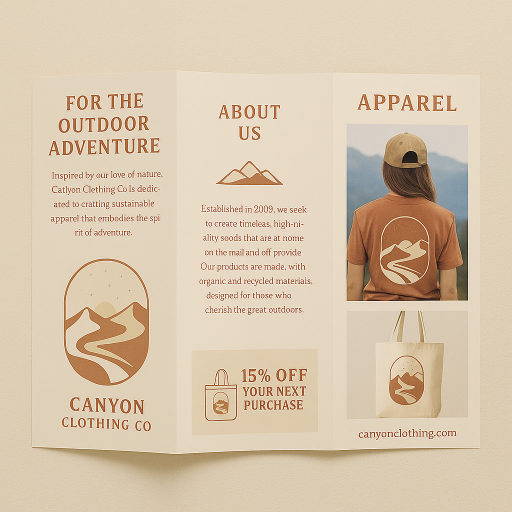
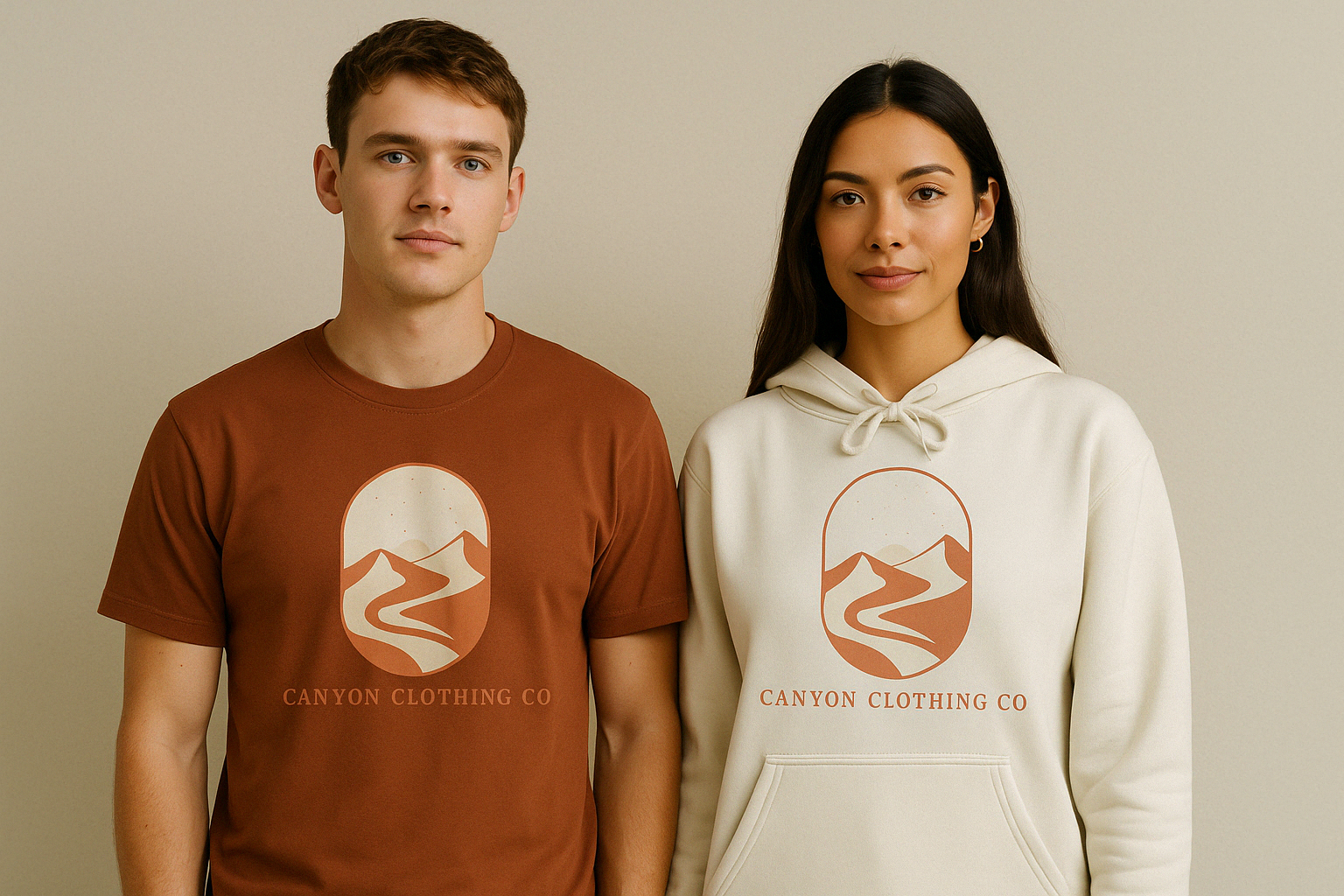
Campaign & Lifestyle Collateral
Developed a visual campaign focused on slow living, seasonal transitions, and outdoor exploration. Photography, layout, and social media assets highlight the brand in use—on trails, around campfires, and in everyday adventure—capturing Canyon’s connection to nature and its wearers' way of life.
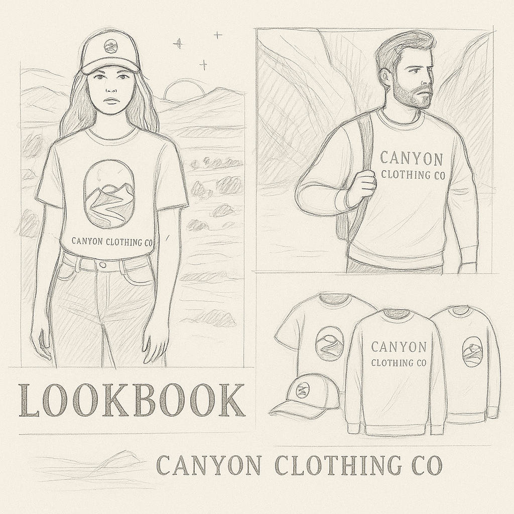
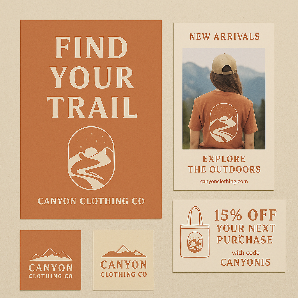
Campaign Storytelling
Built a seasonal brand campaign around the theme of renewal and exploration—mirroring how landscapes shift throughout the year. This included social graphics, lookbook imagery, and printed materials designed to introduce each collection with warmth, clarity, and a sense of journey.
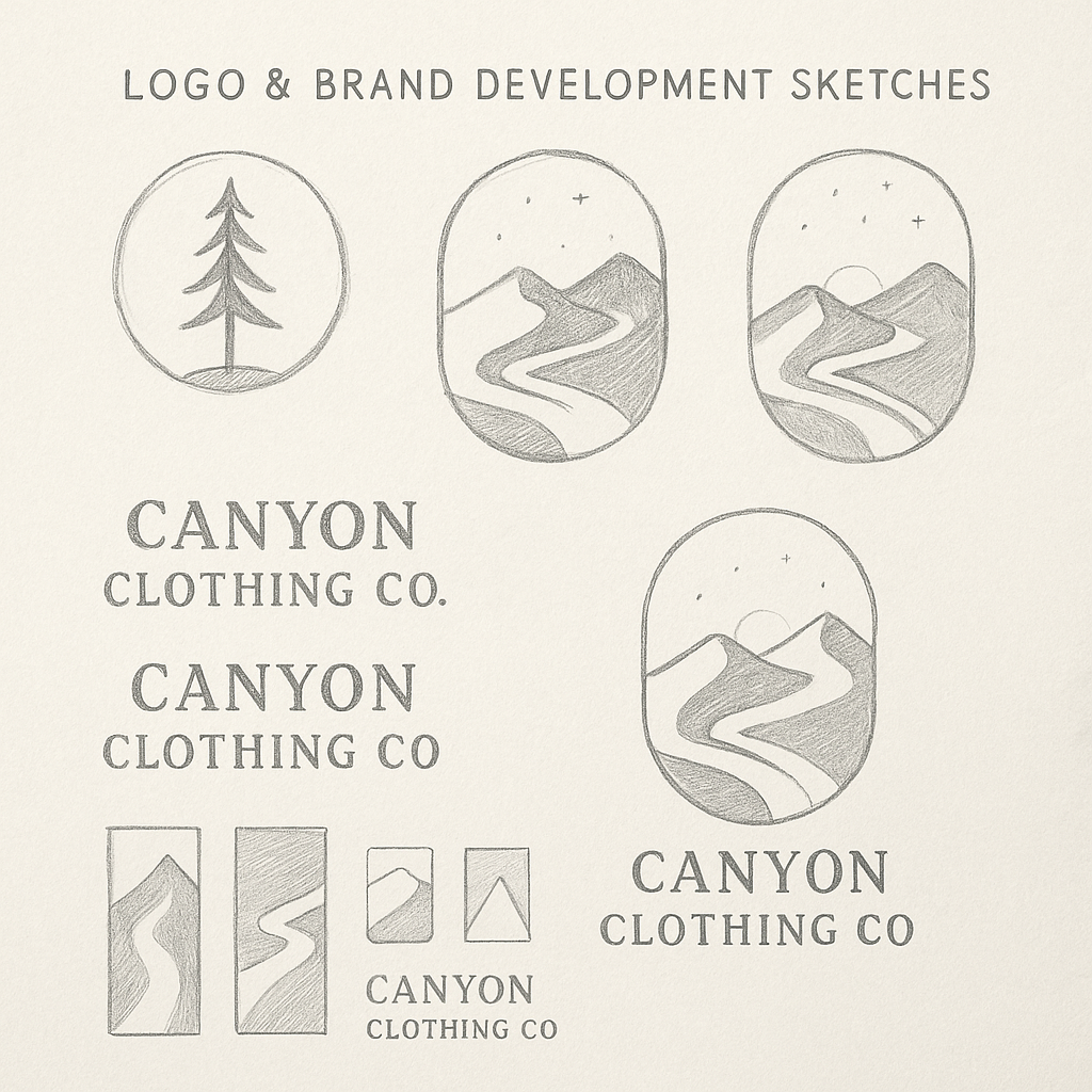
Logo & Brand Development Sketches
Early exploration focused on capturing Canyon’s connection to nature through simplified landscape forms. These sketches test compositions built around trail paths, mountains, and soft geometric symmetry—helping define the final mark’s balance of calm, approachability, and structure. This phase also established the visual tone that carried into apparel, tags, and seasonal campaigns.