Commodore – Brand Identity & Marketing Design
Project Overview
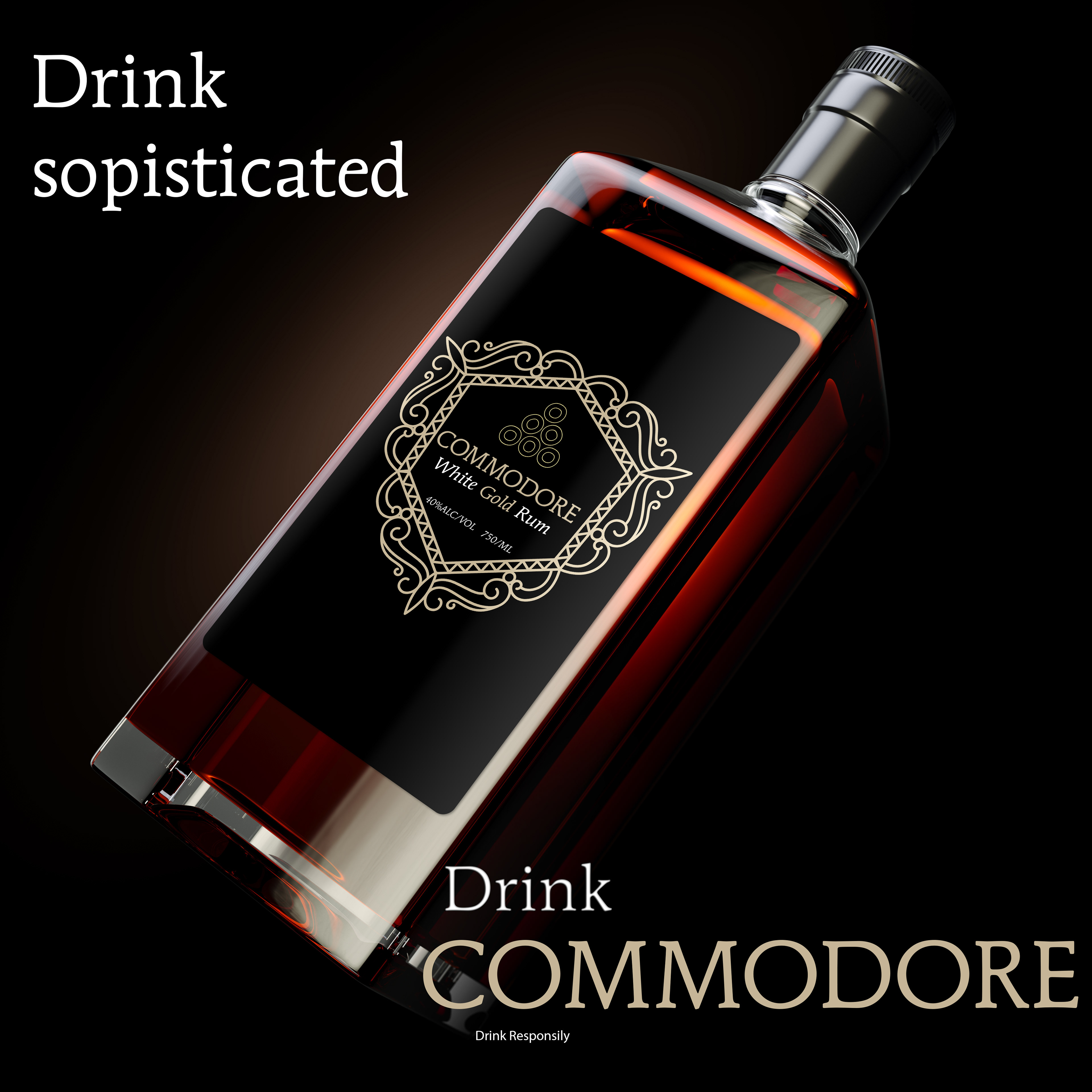
Commodore is a brand that embodies a blend of heritage, strength, and modern sophistication. The goal was to develop a cohesive brand identity that pays homage to classic aesthetics while maintaining a fresh, contemporary appeal.
My Role
I led the full branding and design process, creating:
Logo & Brandmark – A refined, versatile logo reflecting the brand’s history and modernity.
Typography & Color Palette – A combination of bold, structured fonts and timeless colors.
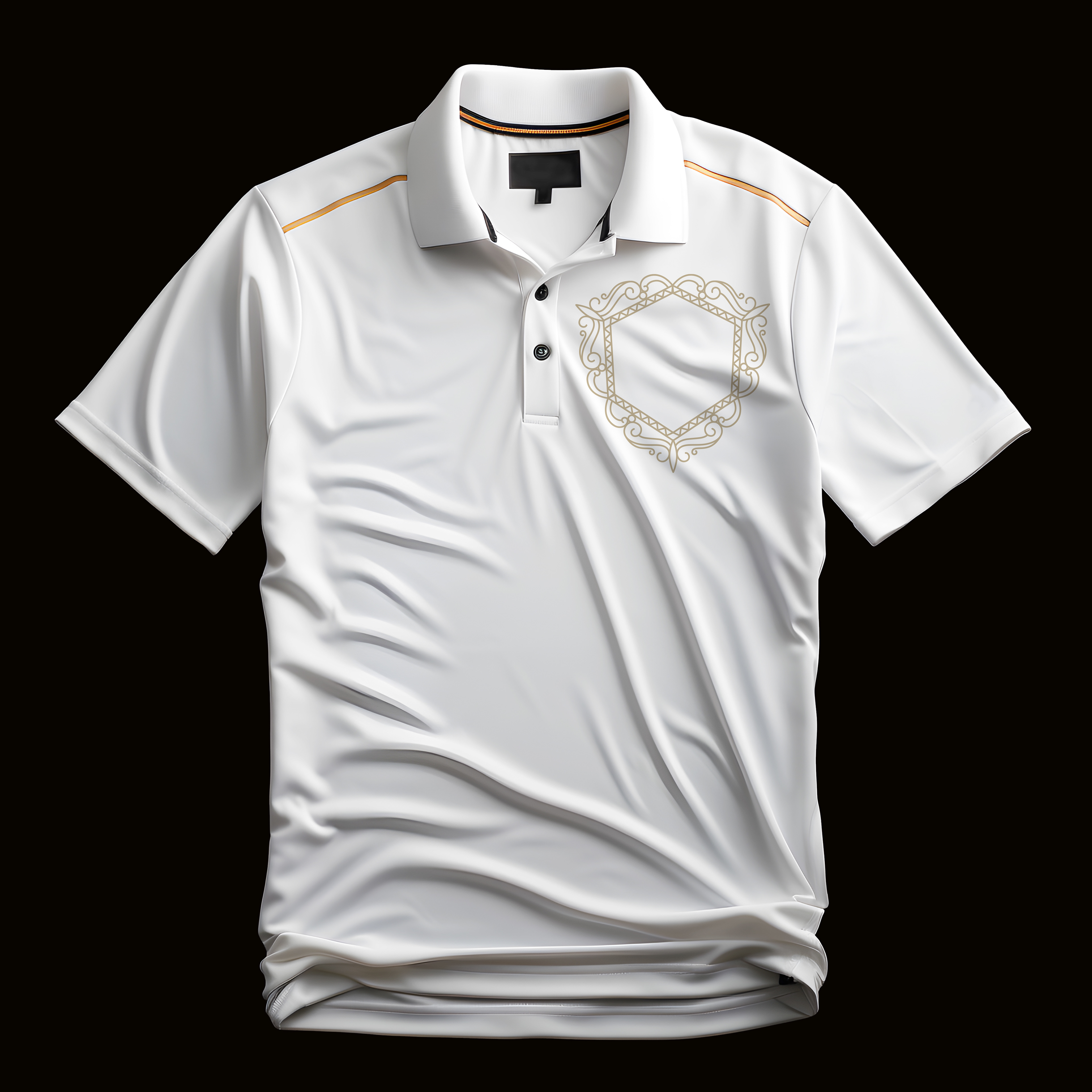
Marketing & Print Materials – Business cards, product packaging, and promotional assets.
Digital Branding – Website assets and social media templates for a consistent online presence.
Design Approach
Logo Design
The logo was crafted with a balance of elegance and strength, incorporating sleek geometric elements for a contemporary yet timeless look.
Typography & Color Palette
Fonts: A mix of bold, serif typefaces for a classic feel and modern sans-serif for readability.
Colors: Deep navy, brushed metallics, and rich neutrals to evoke a sense of prestige and reliability.
Marketing & Packaging Design
Business Cards & Stationery: Minimal yet impactful, featuring embossed details for a premium touch.
Branded Packaging: Designed for a high-end unboxing experience, integrating subtle textures and metallic accents.
Digital & Social Media Assets: Custom templates ensuring brand consistency across online platforms.
Outcome & Impact
Established a strong and timeless brand identity that aligns with the company’s vision.
Created elevated marketing materials that reinforce brand credibility.
Ensured brand consistency across physical and digital channels.
Created elevated marketing materials that reinforce brand credibility.
Ensured brand consistency across physical and digital channels.
Final Thoughts
Commodore now has a refined and memorable brand presence, successfully merging tradition with contemporary aesthetics. The strategic branding approach enhances customer perception and strengthens the brand’s market position.