Overview
Role
Iron Pine is a fictional bar and grill concept created to explore branding in the hospitality space. The goal was to build an identity that blends rustic charm with a modern sensibility — appealing to a wide range of guests, from weekend travelers to regulars looking for a warm, familiar spot. The brand emphasizes bold flavor, inviting atmosphere, and small-town character.
As the sole designer, I created the full identity system including logo design, color palette, typography, menu concepts, merchandise, and signage. I focused on developing a cohesive visual language that felt both handcrafted and polished — designed to scale across print, digital, and environmental applications.
Challenge
Solution
Design a bold and flexible brand identity for a new northern Michigan bar and grill that feels rustic and handcrafted, yet polished enough to support seasonal promotions, live events, and merchandise. The system needed to reflect the atmosphere of the space—warm, woodsy, and locally rooted—while staying clean and consistent across menus, signage, and apparel.
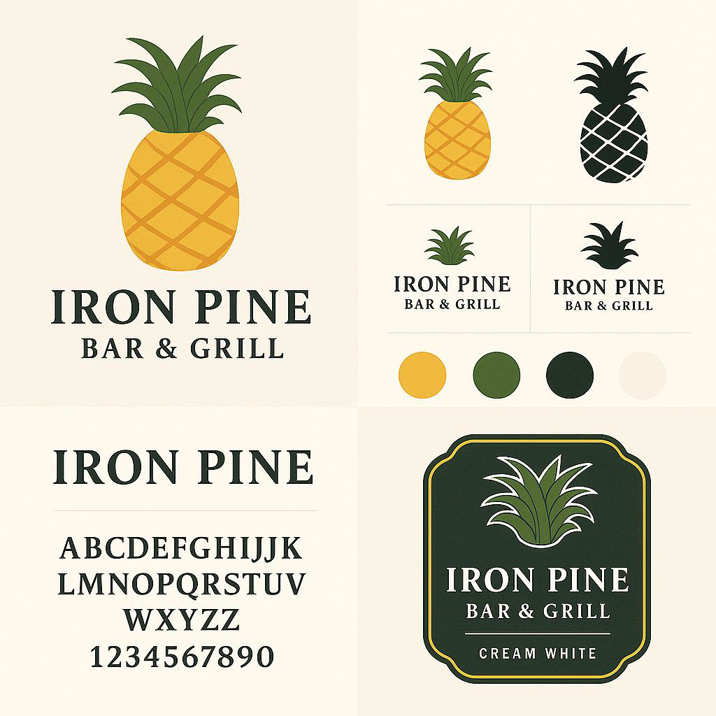
The primary logotype is built from strong, geometric forms softened by subtly rounded corners, evoking both reliability and approachability. A deep green and warm tan color palette supports the brand’s woodsy, grounded tone, while slab-serif and sans-serif typography maintain legibility across formats.
The system is designed to be flexible, supporting everything from large-scale signage and menus to embroidered hats and custom coasters. Icons and typography were chosen to reflect the casual, down-to-earth experience Iron Pine delivers.
Outcome
This project highlights my ability to concept and execute a complete hospitality brand identity — from visual storytelling to production-ready deliverables. It demonstrates senior-level skills in systems thinking, brand consistency, and designing across multiple touchpoints while maintaining a unified tone.
Iron Pine feels authentic because every decision supports its story — making it a brand that’s not just seen, but felt.
The brand helped secure investment and was used across social ads and merch pop-ups.
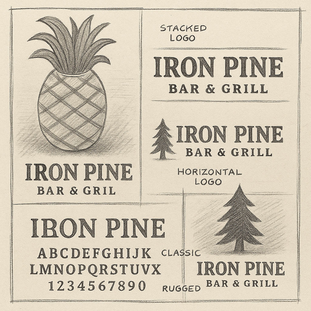
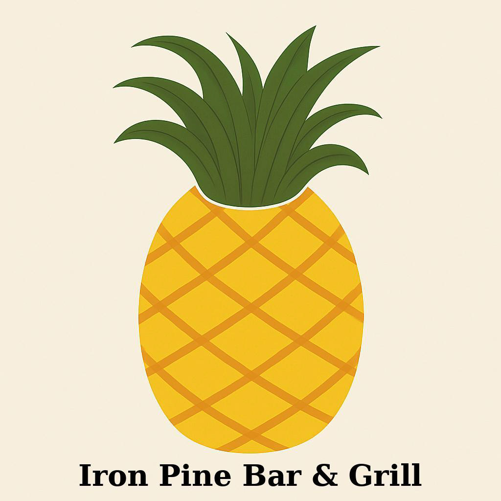
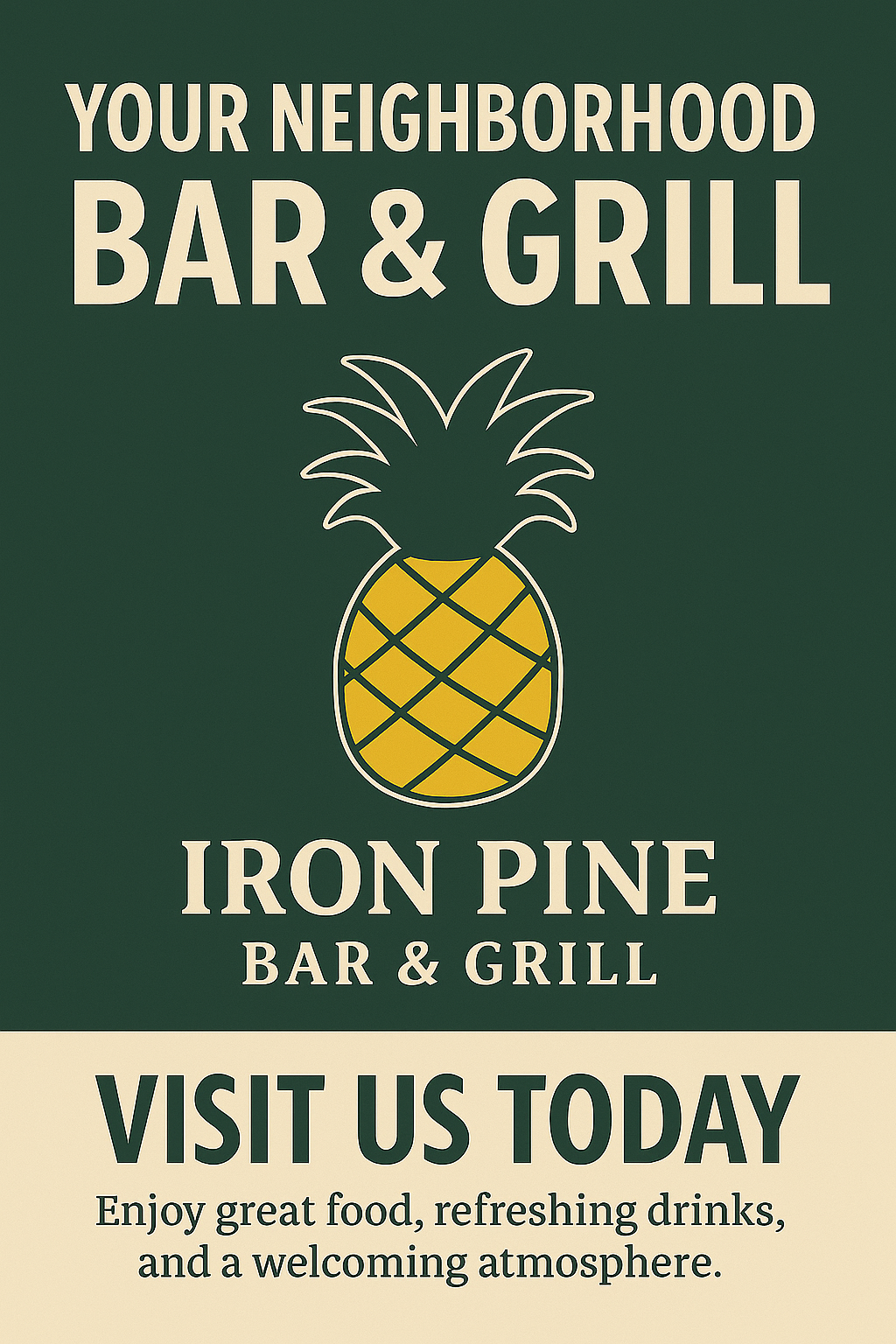
.Logo & Brand Identity
Created a bold, rustic logo system using slab-serif typography and a stylized pine mark. Designed to stand out on signage, menus, and apparel.
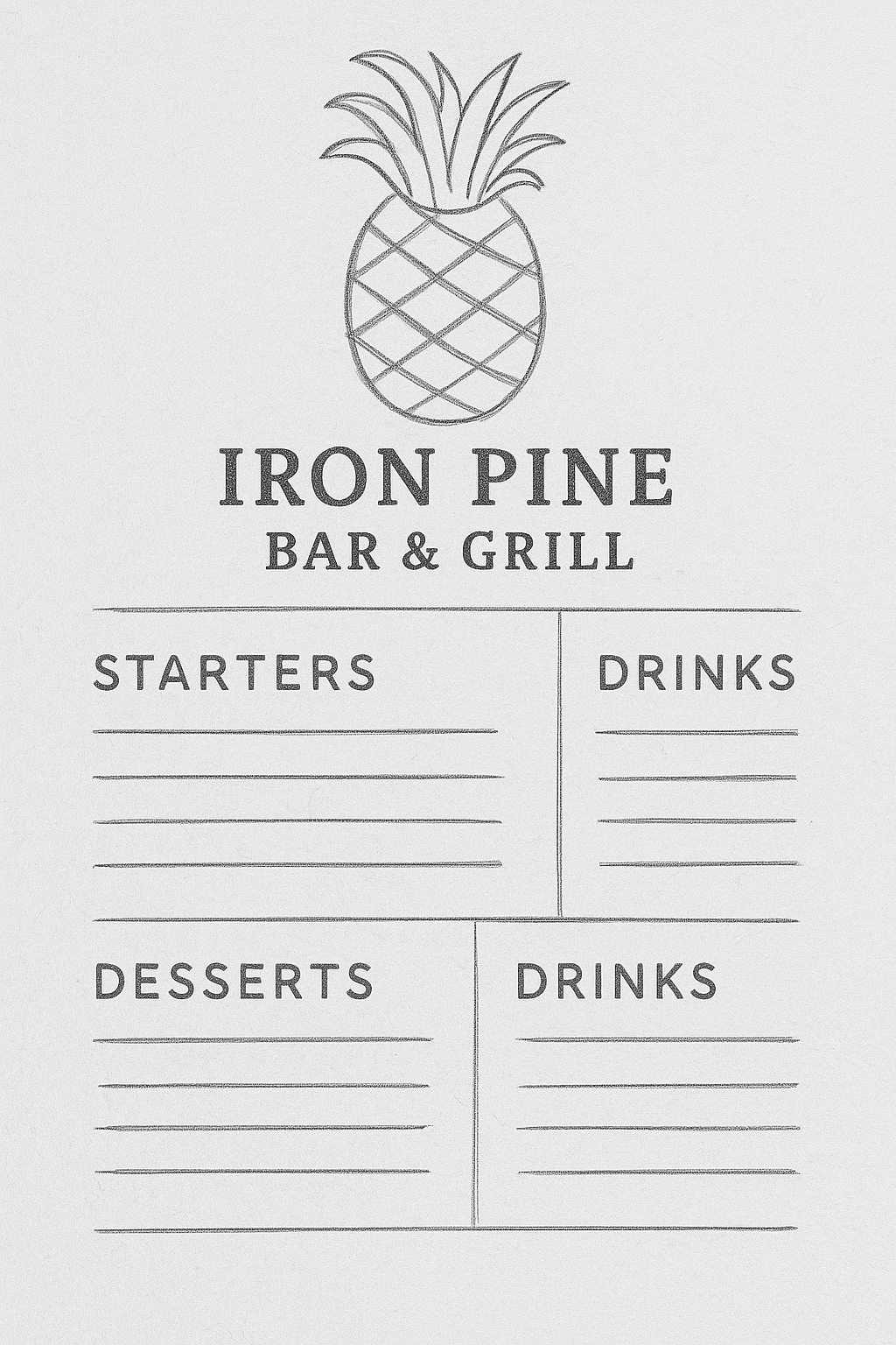
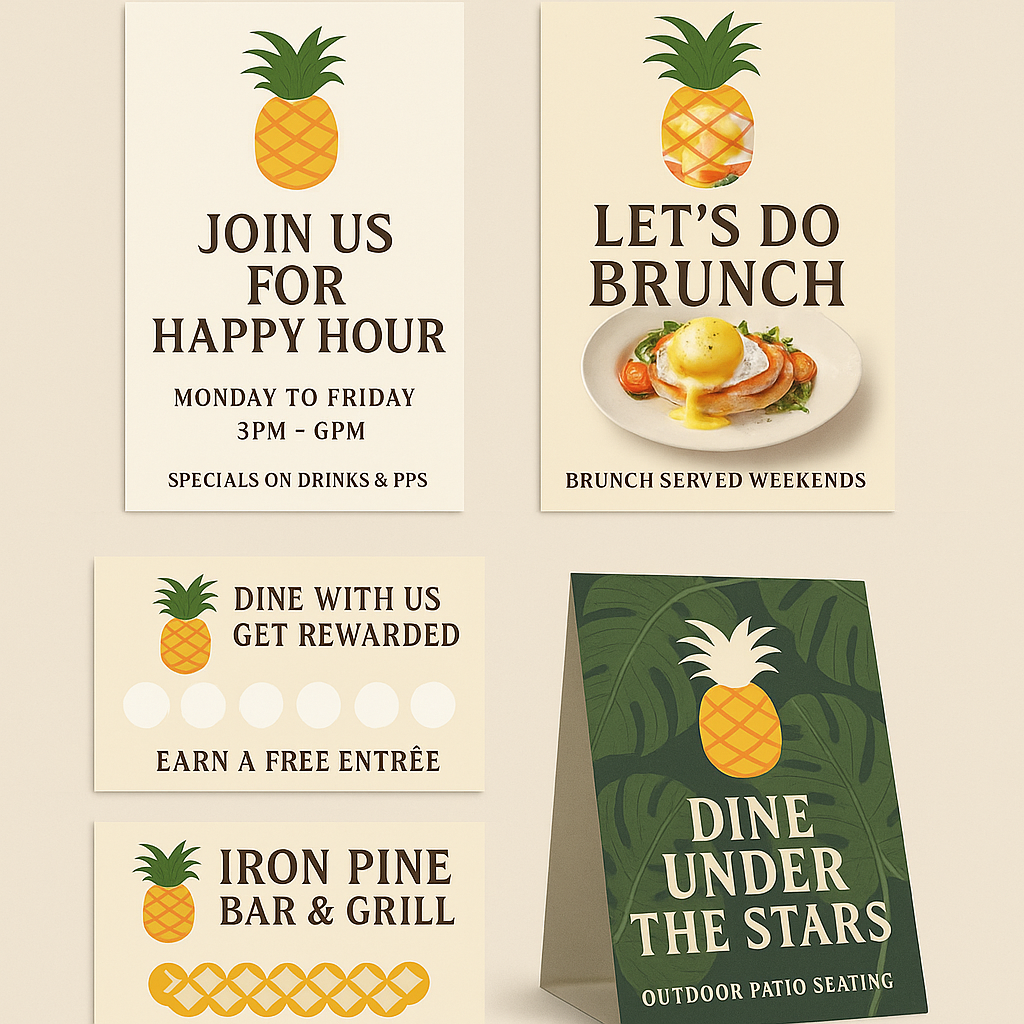
Menu & Print Collateral
Designed menus, flyers, and tabletop cards using rich textures, pine iconography, and vintage layout elements to unify the brand in-venue.
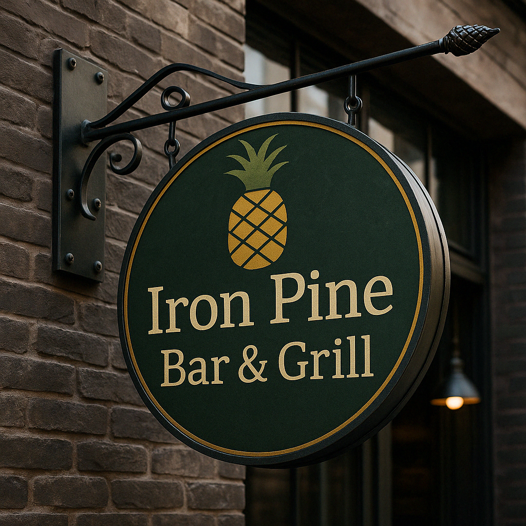
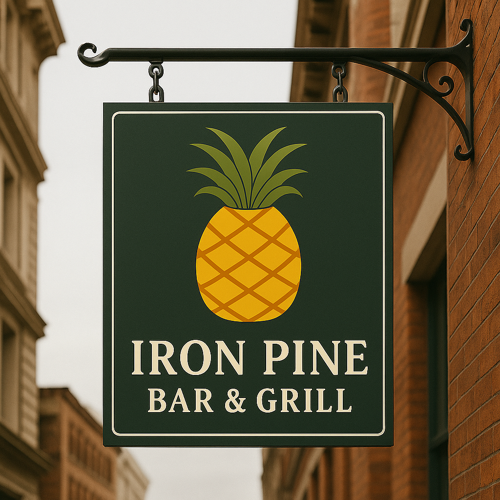
Signage & Environmental Design
Mocked up indoor and outdoor signage reflecting the bar’s rustic-modern atmosphere—using metal textures, dark wood, and strong typographic layout.
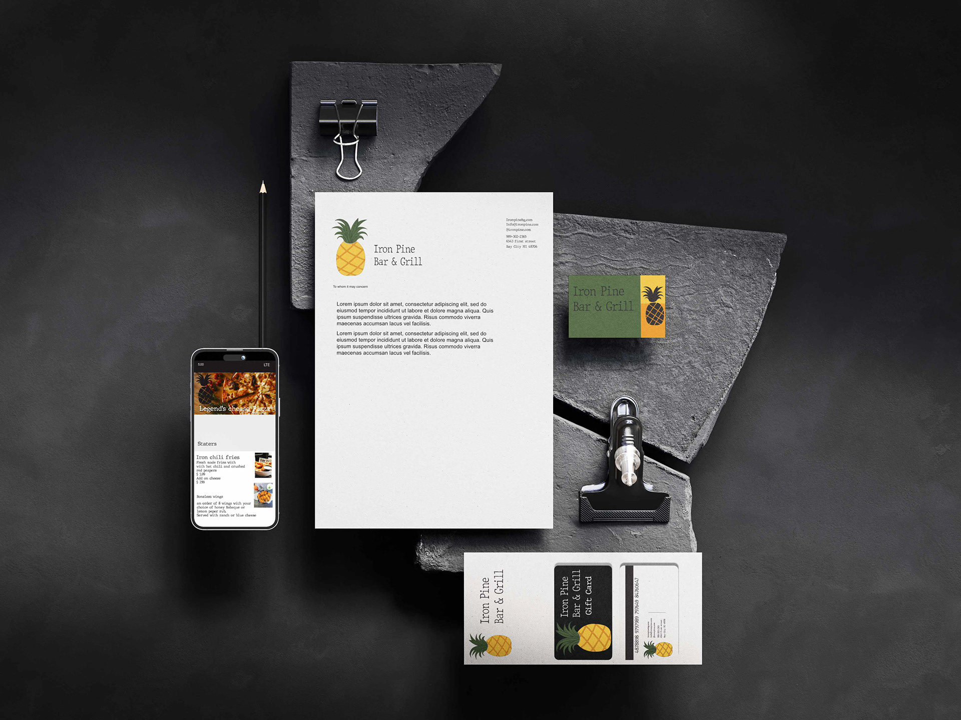
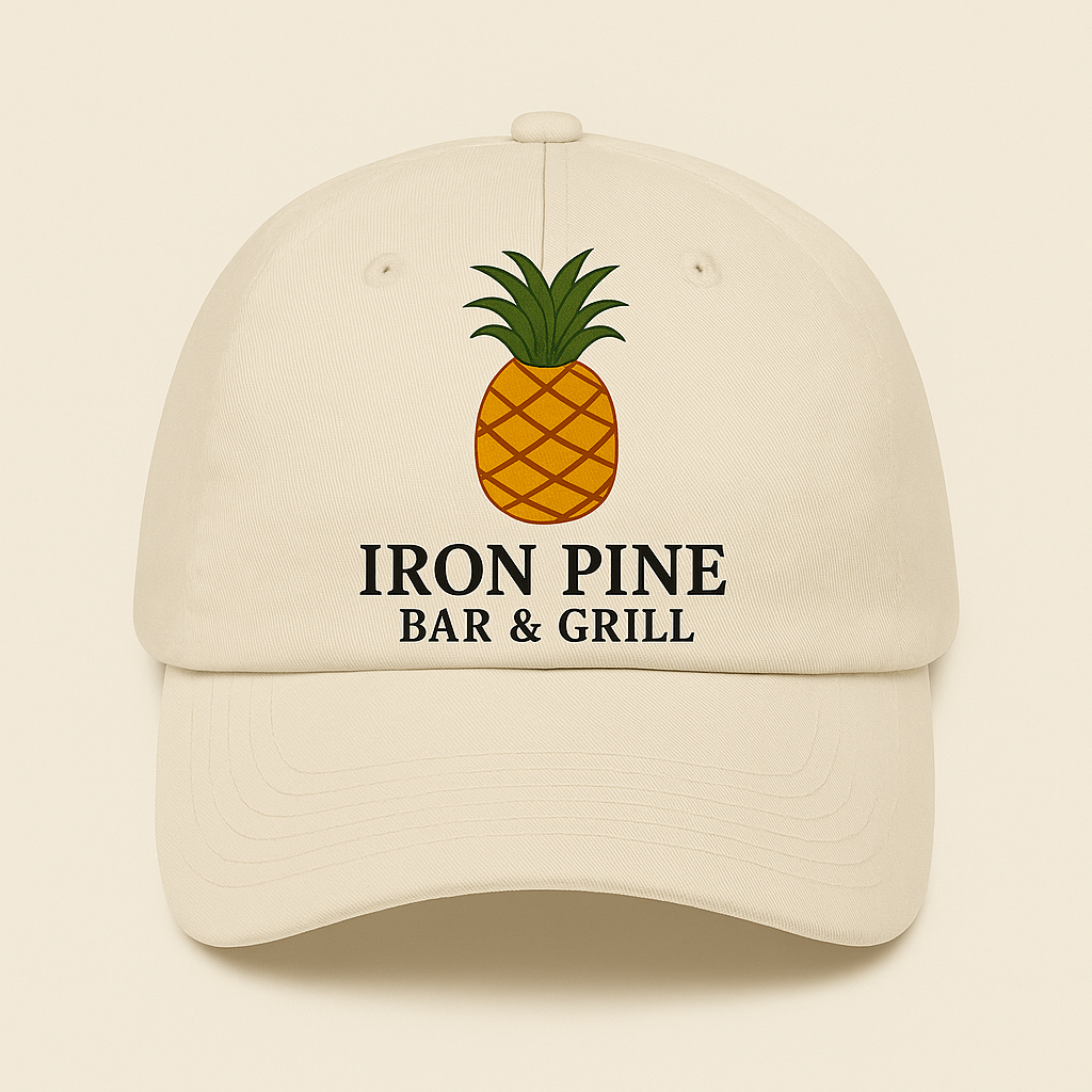
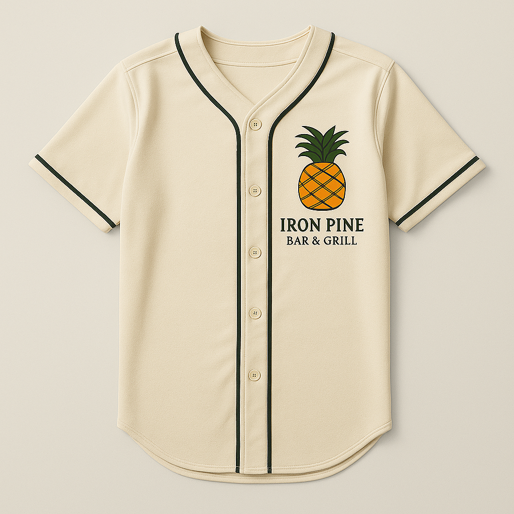
Merchandise & Branded Materials
Developed branded jerseys and hats featuring the Iron Pine logo—designed for both staff uniforms and customer-facing merchandise.
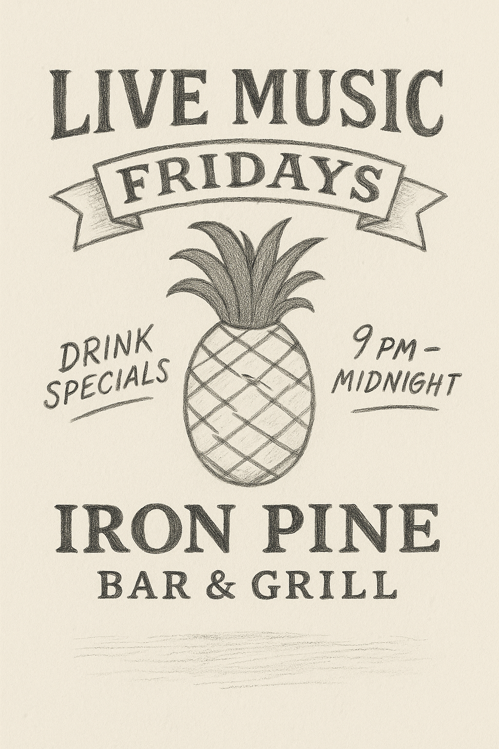
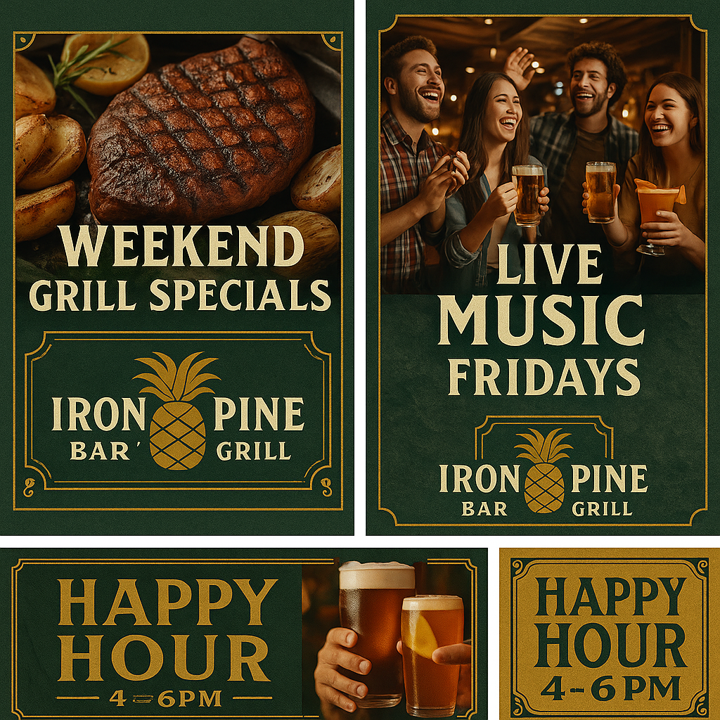
Event & Social Promotion
Branded posters and print materials for seasonal events, live music, and weekly specials. Layouts are flexible, bold, and optimized for both print and social.
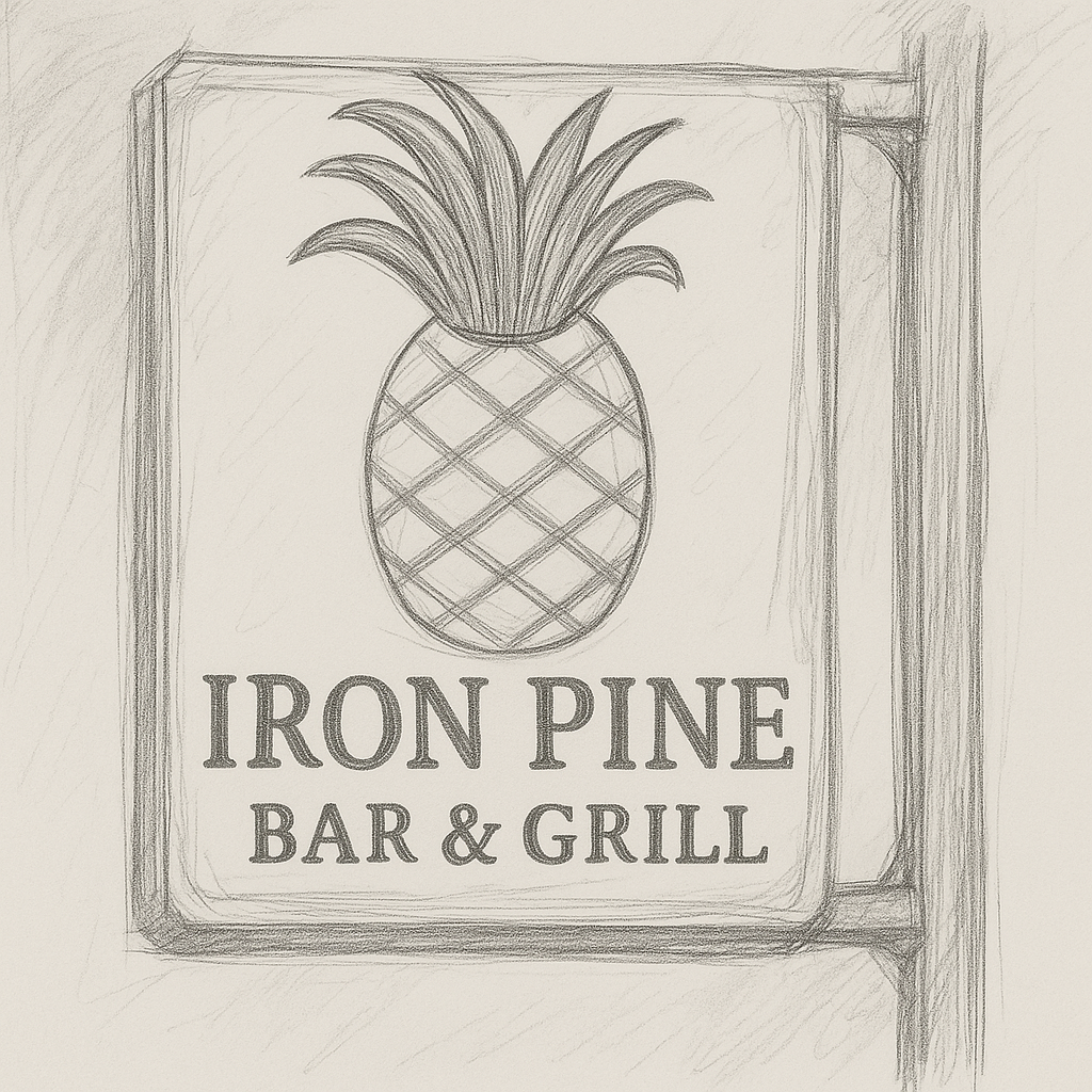
Concept Sketch
This early signage sketch explores how the Iron Pine identity could translate into an inviting, rustic visual presence. The hand-lettered style, pine-inspired framing, and natural texture were designed to evoke warmth and approachability—mirroring the brand’s casual dining experience and Northern Michigan roots.